
GOAL
To visualize the locations most-visited, and general mobility trends, before and during the 2021 COVID-19 Lockdowns in New Zealand.
OUTCOME
Discover and uncover insights about this dataset by simply pointing and clicking. Try it out – click on the dashboard and select different graphics and filters.
Dashboards help you easily visualize your data to gain insights and make data-driven decisions.
STEPS INVOLVED
The following phases took place during this project:
- Identifying the issue and defining problems to solve
- Data collection and processing
- Dashboard sketch
- Dashboard design
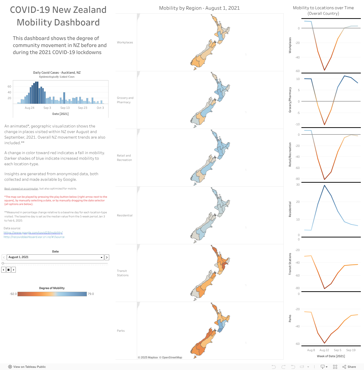
This side project involved creating a Tableau visualization dashboard displaying the movement of people within New Zealand over August and September (before and during lockdowns) on a map with color visuals and a trend graph.
The purpose of this visualization is to gain insights into the way New Zealanders are moving around during this time. This was created out of sheer interest. However, this information can be useful for businesses and authorities surrounding policy responses to COVID-19 in NZ.
Helping you achieve analytics-driven success.
Locations
Auckland, New Zealand
Worldwide (Remote)
Contact
jayden@jaydenreuben.tech
+64 9 889 8031
